
Branding
Dribbble
The Holiday Edition app update needed to live somewhere beyond the product itself. A redesigned app that nobody sees is just a design exercise. The social media campaign was the distribution layer, the work that makes the seasonal experience visible, shareable, and felt outside the app store.
The goal was to create a campaign visual system for Travaro's holiday activation that worked natively across social formats, felt cohesive with the app, and had enough energy to actually stop someone mid-scroll.
Holiday content is the most crowded space on social media every December. Every brand posts something red and green and calls it a campaign. The real challenge wasn't making it festive, it was making it distinctly Travaro while still fitting naturally into a holiday feed.
The secondary problem: social content and app UI operate on completely different rules. What works as a dashboard component doesn't automatically translate to a static post or a story frame. The campaign needed its own visual grammar, derived from the app's identity but adapted for how people actually consume content on Instagram or LinkedIn.
The campaign was treated as a brand extension, not a content afterthought. The same seasonal color system and character language from the app carried into the social assets — keeping Vero present, keeping the teal-and-holiday palette consistent ,but the layouts were rebuilt for feed and story dimensions from the ground up.
The asset set covered the full range of social touchpoints: announcement posts, feature highlights, story frames, and campaign visuals. Each piece was designed to work standalone but read as part of the same moment when seen together. The tone stayed warm and unhurried — travel content should feel like an invitation, not a flash sale.
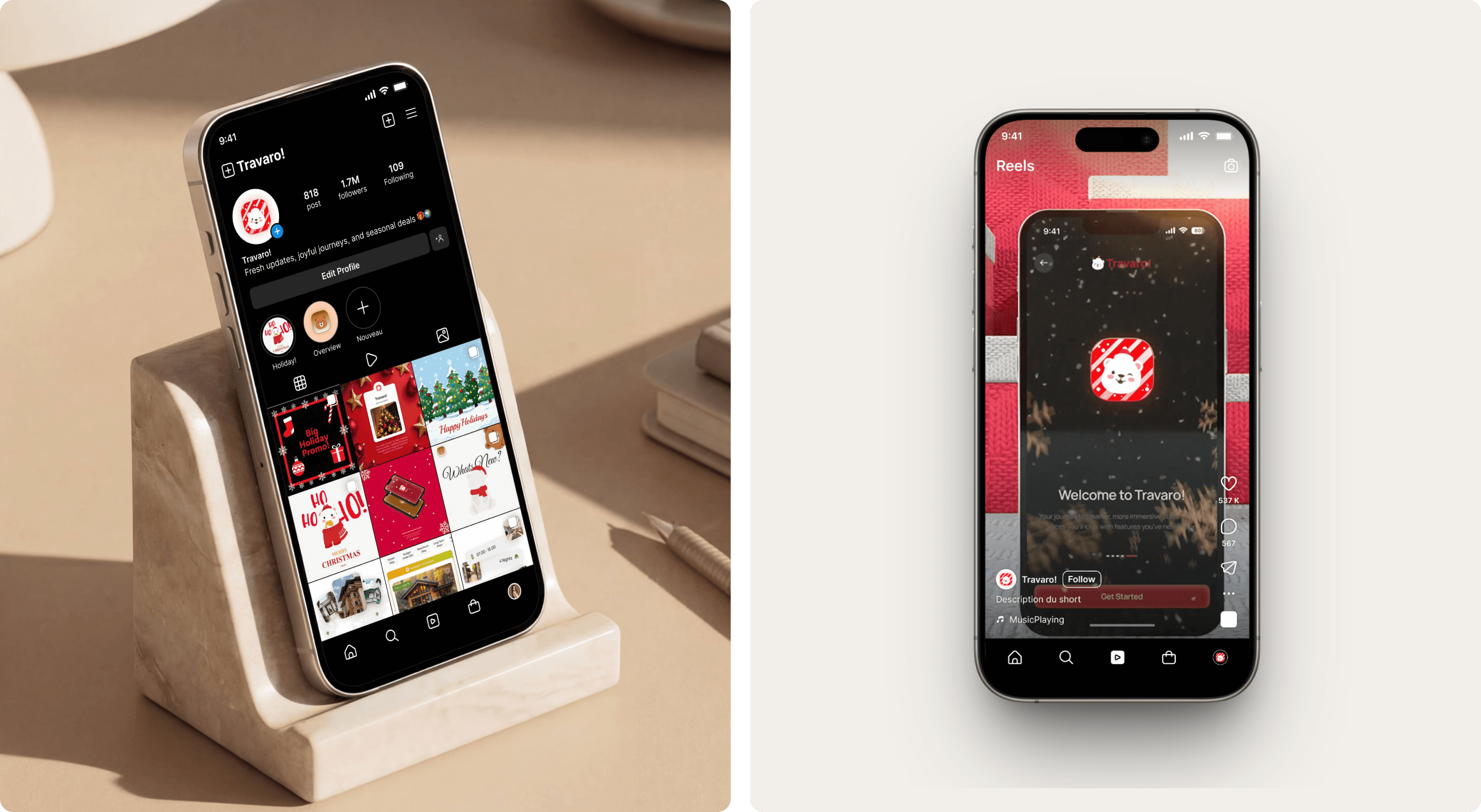
The campaign gave Travaro's holiday moment a life outside the app. For a travel brand, social presence during the holiday season isn't just marketing, it's when people are actually planning trips, dreaming about destinations, and making booking decisions. Showing up with a cohesive, well-designed campaign during that window is the right move at the right time.
More broadly, the project shows something worth noting in the case study: the ability to take one brand system and stretch it across two very different surfaces, product UI and social content, without losing consistency or energy. That's not a small skill. Most designers are good at one or the other. Doing both inside the same project is the thing worth highlighting.
Branding
Dribbble