
Concept
Branding
Web Design
Dribbble
The video content market has a gap that most people don't talk about. Brands know they need video, for social, for ads, for product launches. but the options are either expensive production agencies with two-week turnarounds, or DIY tools that make everything look the same. Sparks was built to sit exactly in that gap.
The brief covered two things: a brand identity that communicates speed, creativity, and professional credibility, and a landing page that converts visitors who are already tired of slow, expensive alternatives.
Video production brands tend to look one of two ways, either overly cinematic and premium to the point of being unapproachable, or template-y and generic because they're trying to appeal to everyone. Neither builds real trust with the actual buyer: a marketing manager or founder who needs good video content without a lengthy production process.
Sparks also had a positioning challenge. "Fast and high quality" is a claim every competitor makes. The brand and the website had to make that claim feel true before anyone reads a single feature description. through the visual identity, the layout decisions, the copy tone, and the overall energy of the experience.
The identity is built around a single mark that does double work ,the S letterform and a play button arrow unified into one geometric icon. Orange as the primary color is a deliberate choice: it signals energy and action without the coldness of blue-dominant SaaS or the aggression of red. The mark is bold enough to work at app icon scale and refined enough to sit on professional collateral.
The landing page follows a conviction-first structure. The hero communicates the core promise in one line, supported immediately by social proof, customer count, industry recognition, years in market, before the user has scrolled anywhere. The three-step process section makes the service feel tangible and manageable. Testimonials from real brand names add credibility without feeling forced. Pricing is transparent and tiered, which signals confidence: a brand that hides its pricing is a brand that isn't sure its value holds up.
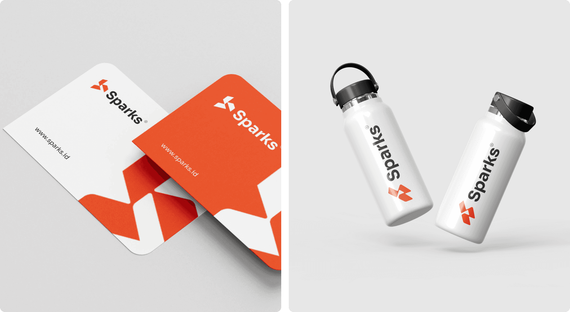
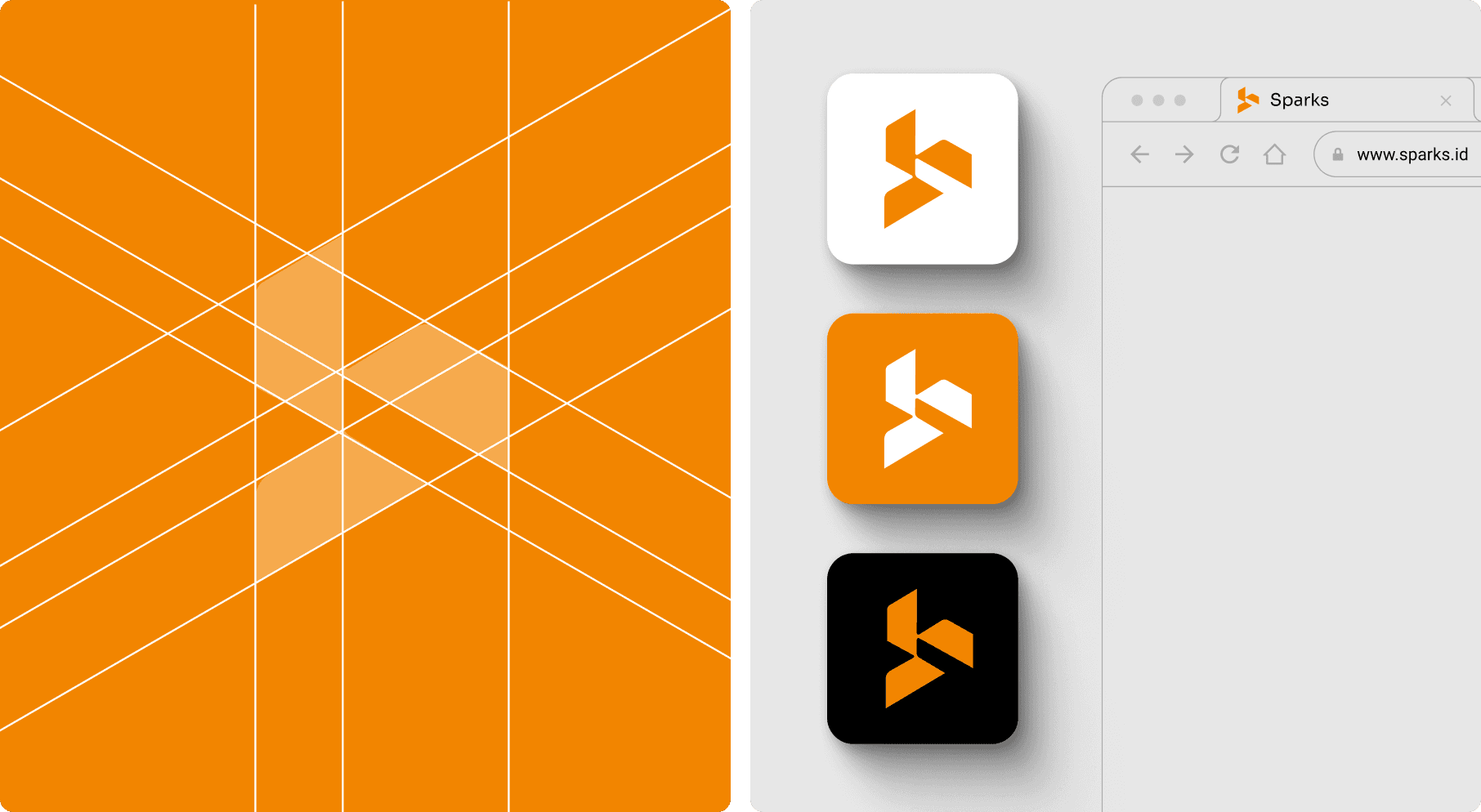
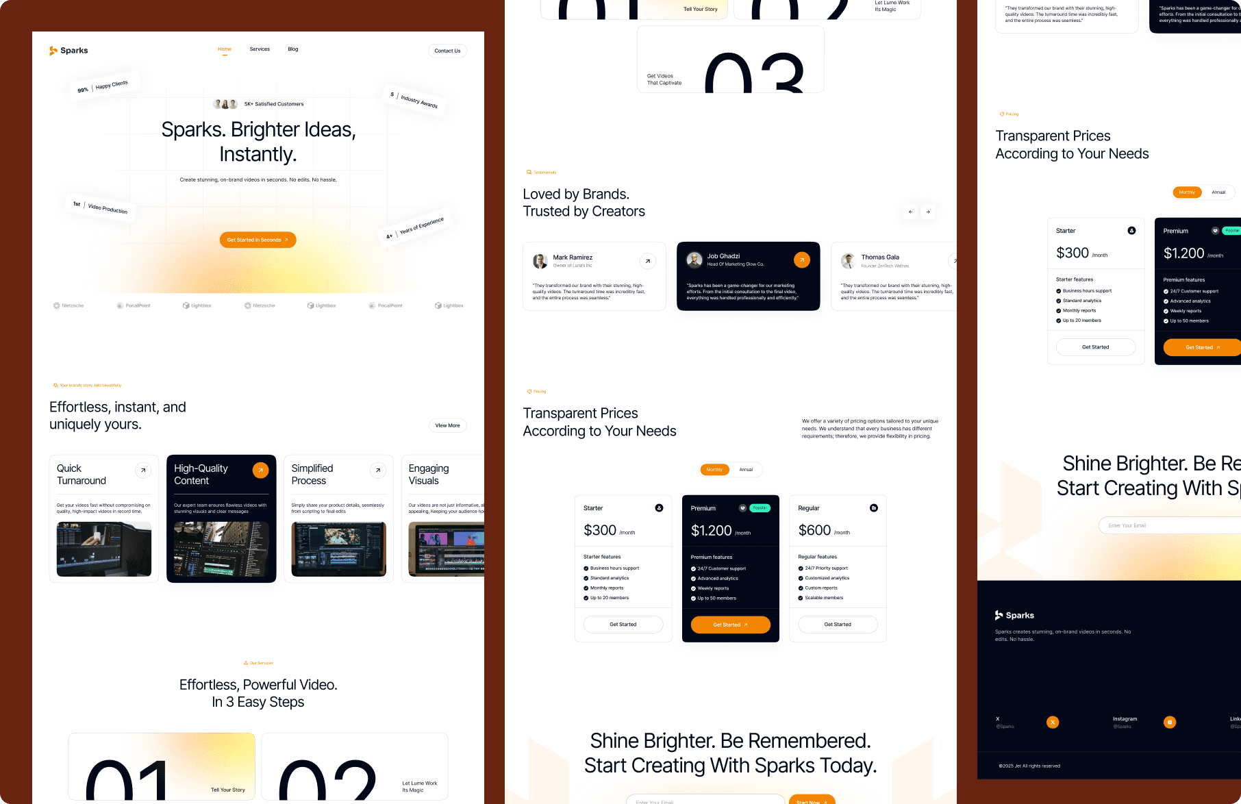
Sparks ends up with a brand and web presence that matches what the product actually promises. The identity is clean and scalable, it works across digital surfaces, merchandise, and UI without losing its character. The landing page is structured to convert a skeptical visitor into a paying customer through a clear, logical sequence: here's what we do, here's proof it works, here's how it happens, here's what it costs.
For a SaaS product in a crowded market, that clarity is not a small thing. Most competitors in this space either overwhelm the visitor with features or undersell the quality of the output. Sparks does neither, and the design is a big part of why.
Concept
Branding
Web Design
Dribbble