
SaaS Design
Web Design
Dribbble
AI tooling is everywhere right now, and most of it looks identical dark backgrounds, purple gradients, abstract orb visuals, and headlines that say "the future of work" without explaining what the product actually does. ARIA needed a landing page that cuts through that noise.
The goal was straightforward: design a full SaaS landing page for an AI productivity layer that communicates real product value, looks credible to a technical buyer, and converts without relying on hype.
The hardest thing about designing for AI products isn't the visual language, it's the clarity problem. Most AI tools struggle to explain what they do in under ten seconds. If the landing page can't answer "what is this, who is it for, and why should I care" before the first scroll, the visitor is gone.
ARIA's positioning a single AI layer that sits across every workflow, is genuinely useful but also abstract. The design had to make that concrete without reducing it to a feature list. Technical buyers are skeptical by default; they've seen too many AI products that overpromise. The page needed to earn trust through precision, not promise.
The design leads with the value proposition before anything else, no hero animation, no abstract metaphor, just the clearest version of what ARIA does and why it matters. The layout is structured as a progressive reveal: what it is, how it works, where it fits, why it's different. Each section earns the next scroll rather than demanding it.
Visually, the page uses a dark, high-contrast system that reads as serious and capable without leaning into the purple-gradient AI cliché. UI previews and workflow diagrams do the explanatory work that copy alone can't, showing the product in context is more convincing than describing it.
The component structure is clean enough to feel like the product itself is well-built, which matters for SaaS conversion more than most designers acknowledge.
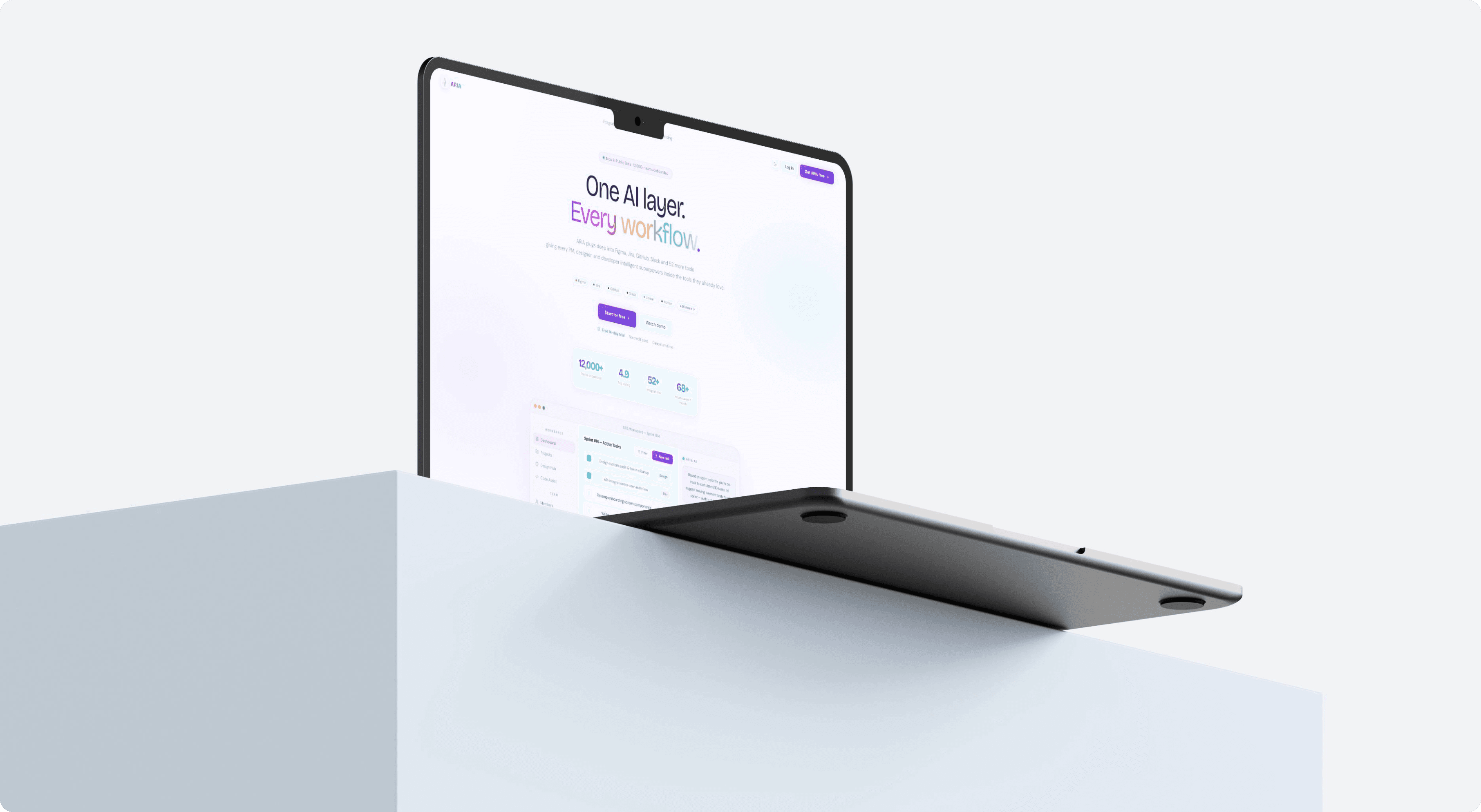
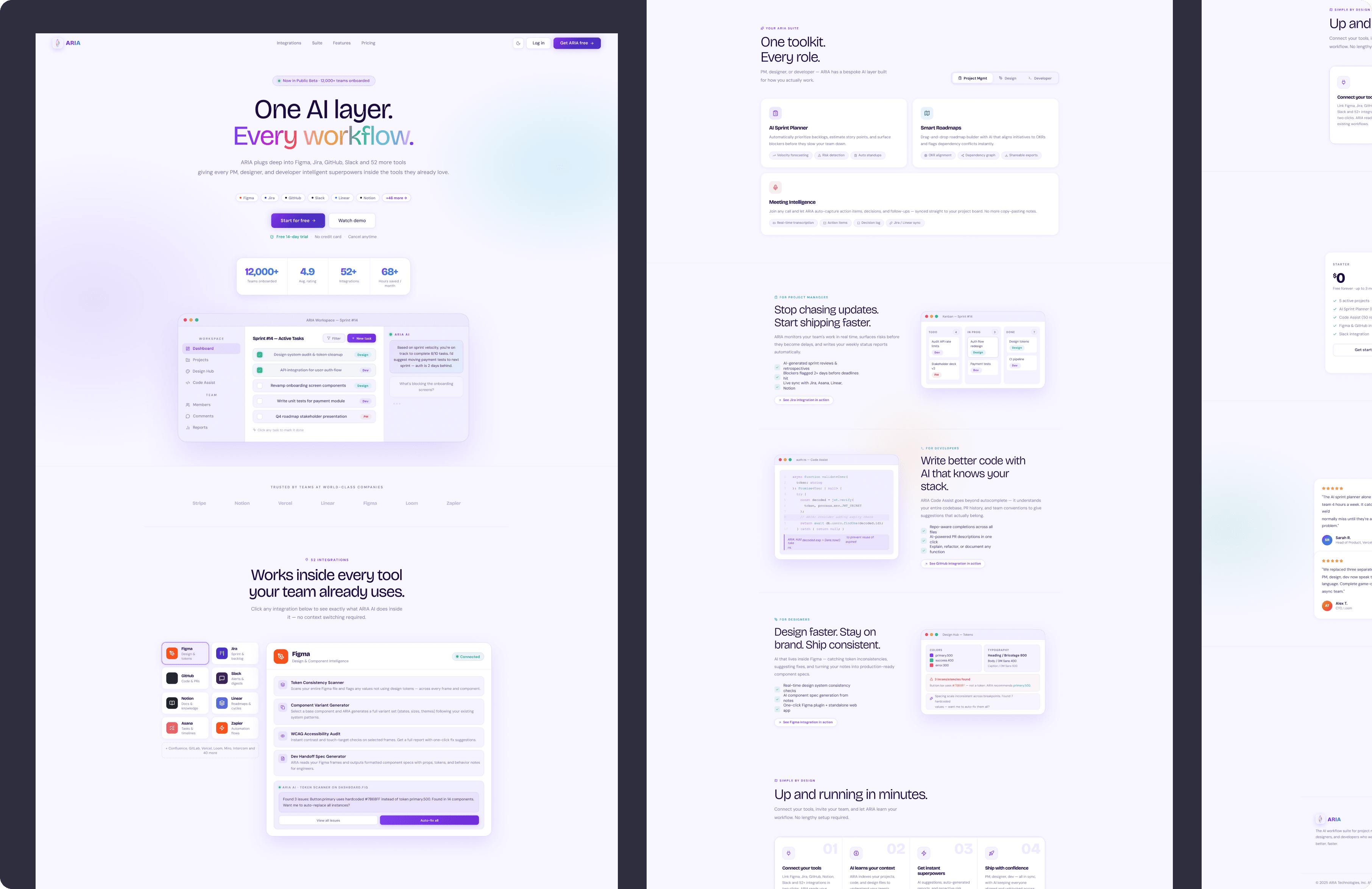
ARIA lands as a product that respects its audience. It doesn't try to impress with motion or spectacle, it tries to be understood, which is rarer and more valuable in this space. For a technical buyer evaluating AI tooling, a landing page that communicates clearly is itself a trust signal: if they can explain it this well, they probably built it well too.
The design also works as a system. the visual language is consistent enough to extend into onboarding, documentation, and marketing without a redesign. That scalability is part of the brief whether it's written down or not.
SaaS Design
Web Design
Dribbble